
For most homes on the Point Roberts peninsula, we steer owners toward mid-tone, muted colors — warm grays, driftwood taupes, deep forest and slate greens, and soft blues that echo the water. These hold up best against the two forces that actually shape a Point Roberts exterior: the gray, low-angle light off the Strait of Georgia and Boundary Bay, and the damp shade thrown by the cedar and fir that surround most lots. Very dark charcoals and near-black siding look sharp in a listing photo but show pollen, dust, and salt haze faster than a mid-tone does, and they run hotter on the handful of walls that catch real afternoon sun. Bright white and pale colors, on the other hand, are the first to show moss and algae streaking on the north and east elevations where the light never quite dries the wall. If you want one answer: a mid-value, low-chroma color — something closer to a stone, fog, or evergreen than a pure white or pure black — gives you the best balance of curb appeal and low maintenance in this climate, and it plays well with the wood-and-water palette most Point Roberts streets already have.
Point Roberts is unusual even by Whatcom County standards: it's a small, mostly wooded peninsula bordered by Boundary Bay to the east and the open Strait of Georgia to the west. That geography sets the terms for every color decision here more than any design trend does. We weighed each option against four things that actually happen to siding on this peninsula:
We did not weigh hurricane or high-velocity-wind exposure ratings into any of this — that's not a Whatcom County condition, and Point Roberts doesn't see it. The wind here is real, but it's a moisture-and-fastener-cycling problem, not a structural wind-load problem, and the fix is proper flashing and fastening under wall assemblies that meet the Washington State Energy Code, not a special siding wind rating.
Gray has become the default "safe" siding color almost everywhere, and on the peninsula it earns that reputation honestly. A warm gray — one with a hint of taupe or brown underneath rather than a blue-gray — reads well against cedar trim, driftwood-gray decking, and the muted green of Douglas fir and salal that surrounds most lots. It also does a reasonable job of hiding the fine dust and pollen film that settles on siding here between washings.
Pros: Wide compatibility with stone, wood, and metal roof accents; hides everyday dirt better than white; ages gracefully as long as it's a true mid-tone rather than a near-black charcoal.
Cons: A cool, blue-leaning gray can look cold and flat under our typical overcast sky — it needs a warm trim or wood accent to keep it from feeling institutional. Very light dove grays can still show algae streaking on shaded walls, just less obviously than white does.
Green siding on a wooded lot sounds counterintuitive — won't it just disappear into the trees? In practice, a deep forest or slate green tends to do the opposite: it makes the house look intentional against the backdrop rather than an intrusion on it, and it's one of the colors we most often see clear a design review without comment on the water-facing streets.
Pros: Blends with the tree line without looking like camouflage; hides moss discoloration on shaded elevations better than almost any other color, since the color itself sits close to moss-green; reads as calm and grounded rather than trendy, so it won't look dated in ten years.
Cons: A green that's too bright or too yellow reads artificial fast — this only works in a desaturated, near-black-green. It can also make a smaller house feel darker or more closed-in without enough white or cream trim to break it up, and it will run warm on any southwest wall that gets full afternoon sun.
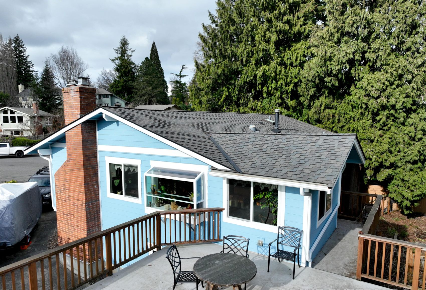
A muted, driftwood-adjacent blue — think weathered dock rope rather than nautical navy — works particularly well on lots with a water view, where it echoes the Strait without trying to match it exactly. It's also one of the few colors on this list that holds visual interest under our gray-sky light, since the blue undertone keeps it from looking dull.
Pros: Complements water views and gray driftwood decking; reads better on overcast days than plain gray; pairs naturally with white or black window trim.
Cons: True saturated blues can look out of place a block or two back from the water, where the context shifts to trees and gravel roads. Blue pigments in some lower-grade paints and coatings are more prone to visible fade than earth-tone pigments, so this is a color where the quality of the finish matters more than usual — ask what pigment system is used before you commit.
These sit between gray and brown and are probably the least risky choice on this list if you're not sure what your neighbors or an HOA will say. They read as neutral without being stark, and they hide both dust and light moss discoloration reasonably well.
Pros: Genuinely forgiving of dirt, pollen, and light algae; broad compatibility with almost any roof and trim color; low risk of ever looking dated.
Cons: Some owners find taupe forgettable next to the more distinctive greens and blues — if you want the house to stand out, this isn't the color for that. On a very shaded, damp lot, the lightest driftwood tans can still show algae on the north wall within a few years if the wall isn't rinsed occasionally.
Charcoal and black-look siding is popular right now, and it does look striking, especially against white trim and metal roofing. We install it, but we tell owners the honest tradeoffs up front rather than let a listing photo make the decision.
Pros: High contrast with white trim looks sharp; hides certain kinds of staining better than white; strong appeal to some buyers if you're weighing resale.
Cons: Dark colors absorb more solar heat on any wall that gets real afternoon sun, which on this peninsula means the southwest exposures facing open water. That heat cycling adds stress to fastener lines and to the wall assembly behind the siding over time, particularly with vinyl. Dark colors also show dust, pollen, and salt haze as a dull film rather than hiding it, so a dark house near a gravel road can look chalky within a season or two if it isn't rinsed. And black or near-black is the color most likely to draw a second look from a design review here — check before you commit.
Classic and crisp, but the color most likely to disappoint a Point Roberts owner within a couple of years if the lot has any shade at all.
Pros: Timeless, pairs with almost anything, makes a small house look larger and a wooded lot feel brighter.
Cons: White shows moss and algae streaking faster and more visibly than any other color on this list — the contrast between clean siding and the first green-black streak under a downspout or eave is stark. On shaded north and east walls, that streaking can appear within a single wet season. White is workable on a lot with good sun exposure and airflow, but on a heavily treed lot we'll say so plainly before recommending it.
A few choices cause more callbacks than others on this peninsula, and it's worth naming them directly:
None of this is about hurricane-rated products or wind-load engineering — that's not a condition Point Roberts sees. It's about moisture, shade, and the low, gray light that defines this part of Whatcom County most of the year.
The color itself doesn't cause moss or algae — shade, moisture, and airflow do that. But color affects how visible the growth is and how it reads to the eye. Light colors show green-black streaking almost immediately, while mid-tone greens and grays can carry light algae for a season or two before it's obvious. Either way, the real fix is trimming back overhanging branches for airflow and rinsing shaded walls occasionally; color choice just changes how forgiving the wall is between cleanings.
It's a real effect, not a myth, but it's a matter of degree. A dark, southwest-facing wall that gets direct afternoon sun will run measurably hotter than a mid-tone wall next to it, and that heat cycling adds stress to fasteners and to whatever's behind the cladding over the years. On a shaded or north-facing wall, the same dark color barely matters. If you want a dark color, we'll usually suggest it for the shaded elevations and something lighter for the sun-exposed ones.
It depends on which part of the peninsula you're in — some subdivisions and beach communities have architectural guidelines, and others don't but have a strong informal expectation about what fits the street. We ask early in the estimate which community you're in and, if there's a review process, we'll help you pick a color that's likely to clear it the first time rather than guess and resubmit.
That depends heavily on material, exposure, and how the color was applied — factory-finished fiber cement and vinyl hold color differently than field-painted wood, and a wall facing the open Strait weathers faster than a sheltered one. We won't quote you a made-up number of years; what we can tell you honestly during an on-site look is which of your walls will show wear first and which finish options are worth the extra cost for your specific exposure.
Picking a siding color from a swatch card is a guess. Picking one after someone has actually stood on your lot, looked at which walls face the water, which stay shaded under the trees, and what your neighbors have done, is a decision. Alpine Exteriors (WA contractor license ALPINI751OW) serves Point Roberts along with the rest of Whatcom County — Bellingham, Ferndale, Lynden, Blaine, Birch Bay, Sudden Valley, and the islands — and we bring large-format samples out to your property so you can see the color in your actual light before you commit. If you're weighing a repaint or a full siding replacement, reach out to Alpine Exteriors for a straightforward, on-site color consultation and estimate.